Sider

torsdag den 17. november 2011

Logo Designs

Various Logos

Logos that I have designed over the last couple of years.

Designing logos are rarely easy. You want them to be perfect, and so does your client. And some times you don´t agree or it takes a long time to get it right.

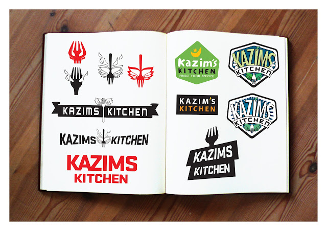
The logo which took the longest time is the Kazims Kitchen logo and the quickest one is the McKorman logo, where the idea came to me in a couple of hours.


ME SO HUNGRY

Asian Everyday Cooking
Take Away Restaurant

MENU CARD


KAZIMS KITCHEN

Restaurant
Logo design
 SIGN OUTSIDE RESTAURANT

COBOS BIO
Online Childrens Entertainment


Facebook page


Kunde & Co

Grundfos & Komax Solar


I also enjoy doing more conservative designs. This Grundfos folder design was made using existing photomaterial. I used the blue and orange color plus the red found on the pumping systems, in the design and a very square looking layout to give it a balance and rhythm. The folder is folded three places with a flap to keep papers from falling out.
Forside og skitse til karakter

Front
Inside


Komax
Komax is a large company that among many things produces solar panels.

Together with a small group of AD´s and copywriters, we came up with a new direction for the Komax Solar branch.
Using the X from the logo and the concept of solar heat.

Design and layout of the brochure and the website (the website design was a proposal, but to my knowledge never used.)


Copyright Kunde & Co


Pallesgavebod.dk

Merchandise, logo and web design


windowsticker (100 x 100 cm)
Pallesgavebod.dk is a danish national childrens library website.
This site collects all the danisk childrens libraries in one place, in order to give the kids a better and easier way of finding stuff or getting inspiration.
website here:
www.pallesgavebod.dk

You can find the themes I made here (The first 6 if you start from the bottom):
www.pallesgavebod.dk/tema


Job description:
Art Direction (web and print)
Logo design
Graphic design (web and print)
Poster Design
Layout
Collection of information and material
Video editing and post production (Adobe Aftereffects)
Flash game graphics and animation

I designed the Logo.
I did not design the main website, my job was to create unique sub-sites with varying themes, e.g. Nerds, Living Under Ground, Secret Agents, etc. Additional 3D modelling and posing, was done by Gill Frank and Torben Søttrup. Art directed by me.

Her is a sample of the stuff I made, including posters, merchandise and giant stickers.


Wallpaper


Poster


Copyright Copenhagen Bombay


mandag den 7. november 2011

The Great Bear

Film poster design and advertising

I worked as AD on the design of the teatrical poster for the CGI animated feature The Great Bear.
The film is directed by Esben Toft Jacobsen (whose filmschool graduation film poster I also did).
Produced and distributed by danish film company Copenhagen Bombay.
The film has won several international film prizes.

I also designed the films website here:

International/English version:


This poster was not an easy job, but fun. With sketching and 3D posing (by a 3D modeller and poser), lighting and then finishing, retouching and adding film title, corporate logos, etc, I think it took me two weeks working around the clock. It was hard but I think it paid off. I got a lot of experience out of that one poster alone..


Website:

Screenshot of the official (danish) website for the movie. 


Sketches:
Below are some of the sketches I made, trying to find the right image for the poster.
This one was a sketch for the teaser poster. Sadly never used. See if you can find The Great Bear..


Sketch for the film poster


A more thorough sketch. But I decided that it was too crowded.
But I liked the "Adventure movie" style it had.


Copyright Copenhagen Bombay


Yas Marina Circuit

Merchandise Concept


Yas Marina Circuit is a newly built Formula1 race track in Abu Dhabi.
I designed 3 lines of mechandise for a merchandise firm located in Abu Dhabi
Each line has a distinct style and concept.


Style 1:
 Applied to merchandise:
 Style 2:
 Applied to merchandise:
 Style 3:
 Applied to poster and merchandise:

Me So Hungry

Logo, menu and display design

This is one of my favorite design jobs.
The place, Vietnamese cuisine Take-away, originally started out being called "Lychee Lee´s Delivery" and the overall look was very conservative and very...boring.

Thankfully, in the eleventh hour (normally NOT a good thing) the owners decided to change the name to something far more dynamic, funny and fresh: "Me So Hungry". For those that don´t know, the name is a pun on the song "Me so horny" by Miami rap group 2Live Crew.
I recommend that the logo and overall look of the "brand" should be more cartoony and simple, with inspiration from asian noodle and toy packaging. The owners and myself wanted the logo and name to distance itself from traditional and oldfashioned oriental restaurants. The final design is much fresher, positive and with a playful style that suits the name.
The typefont is hand written and cleaned up in Adobe Illustrator.

menu card and outdoor advertising.
2 wall decorations, each over 1 meter tall.

Kazims Kitchen

Logo & signage design

Logo design for a local diner/take-away restaurant, with Afghan roots.
I designed the logo from scratch, with feedback from the owners.
As you can see on the following image, I went throuh a lot of sketches before a general direction was chosen.

Above: Final Logo design + 2 funny ideas for special ketchup and mustard labels

A LOT of sketches..

Finally the logo as a sign outside the restaurant.
Sadly the place closed down a year later, but I was lucky to get some photos.
I am very pleased with the final results.